Sunday, September 18, 2011

Country Bumpkin to Modern Pumkin

When fall arrives, there's nothing better than a trip to the garden or pumpkin patch to pick out the perfect candidate for your family's jack-o-lantern. But this year, try putting the pumpkin in disguise.  You can spray-paint the garden goods in metallic colors, and watch small gourds and pumpkins transform from autumnal orange to sophisticated silver.  Mix these simple projects with mercury glass pumpkins to dress up your dining room table or create an elegant arrangement.  It's an inexpensive way to make traditional a bit more modern.  If everyone else is dressing up for Halloween, why shouldn't the pumpkin?  It's a simple trick-- and a special treat.


The picture above is a mix of a large mercury glass pumpkin surrounded with painted metallic silver gourds and black pumpkins.  Used black and silver chargers under white dinner plates and a glass salad plate accented  with a black leaf that was painted black.


In the picture above a grey table topper is used to soften the table and anchor the centerpiece.  Two black arrangements accented with silver help add height and focus to the chandelier.


Two metallic painted silver pumpkins are placed on black candlesticks to add height to the grouping.  The tray in the middle is holding a black shallow glass bowl filled with two mercury glass pumpkins, white and black painted pumpkins and gourds.

 If the orange and autumn colors don't work with the  color scheme of the home go grab a few spray cans of paint and dress up your pumpkins the fall.

Friday, September 9, 2011

Front door First

The changing of the weather, as it cools down, is like a breath of fresh air that starts with the front porch and flows throughout the home.  Create a front porch that radiates an inviting and homey feeling that you want friends and relatives to experience as they come to visit over the holidays.   Be sure and add different textures and shapes to your autumn decorating, such as cornstalks, hay bales, florals, burlap fabrics and outdoor pillows to cozy up the area.  


Sunday, May 22, 2011

Escape Away

We tend to want to decorate out entire homes but sometimes forget to treat ourselves to a cozy bedroom retreat.  Last week we discussed children's rooms so this week it is time to focus on ourselves.  Our bedroom should be one of our favorite places in our homes.  The best place to start transforming a room is the bedding.  Bedding should set the tone for the entire room.

The soft white and tan bedding help create a peaceful environment that makes anyone ready to crawl right back into bed.  The comforter was folded back and two pillows that get slept on are covered up to create a fluffy roll in the middle of the bed.  Allowing only decorative pillows to be displayed.  
This bedding was purchased at a discount store.  One doesn't not to spend a fortune to create a relaxing getaway.  The greens mixed with accidents of brown add just the right amount of color without overwhelming the space.  Summer is a great time of year to bring in the bright fun colors that don't seem to fit with the drab winter months.   If money is tight just go for a bed makeover and feel like you have an entire new room to escape away.

Friday, May 13, 2011

4 WAYS TO FIND IDEAS FOR KID'S ROOMS

It is so tempting to think of pale pink for girls and blue for boys when choosing room colors.  There are other ways to get inspiration for decorating kids rooms.  Children's rooms are a special place in the home that should reflect the interests of the child and blend with the rest of the decor.  

1. TREASURE AND COLLECTIONS.
Your child will love being in a room that reflects their interests and hobbies.  Here I have displayed the childs artwork along with many other interests and awards.


2. START WITH ART.
Just as a child learns to appreciate sports and activities by early exposure, they can learn to recognize and love the world of art by having it around them.


3.  TRAVEL MEMORIES.
It is always fun to bring back souvenirs from trips and sometimes these can fit into a child's room.


4. REMINISCE
Frame special pieces of crafts, art, household items, or baby blankets that have special memories for your child.


Sunday, May 8, 2011

One of my favorite colors for spring and summer is coral.  Coral is bright, fun and cheery and can brighten up the simplest of spaces.  Ranging from deep reddish hue to orange and edging into hot pink, coral's many variations make it a color for almost any space.  Add a little coral accent  to all those brown rooms we have created over the past few years .  In the picture above I have found a few pieces from Ashley furniture and Hockman Interior Design Boutique.  

Tuesday, May 3, 2011

Creating Outdoor Spaces

To help make the outdoor space feel like an indoor living area it is important to bring in soft throw pillows and accessories that will be able to with stand the outdoor elements.  In this space we decided to bring in the bright blue and yellows to add color.  Wether or not you have a patio or covered living space the outdoor rugs help anchor furniture and softness to a space.
By adding an area rug from Lowe's for $100 and outdoor furniture from Target I was able to help create a place the home owners will want to go and enjoy.  One of the important factors in decorating outside is to add lots of live plants to warm up the area and help create privacy with tall plants or trees.
Before decorating the screened in porch the room lacked interest and wasn't a place one could go relax and enjoy the outdoors.

Sunday, April 17, 2011

Spring Tablescape

Easter is just around the corner and many of you are probably getting ready to entertain for the holiday weekend.  Don't feel like you have to decorate with  bunnies and eggs for the tablescape.  Below I have decorated with lots of green textures, silver and a pop of white with the birds. To soften the table I have added a grey table topper to center the arrangement.  Next,  glass vases were used to  plank a three tiered platter filled with small nests, flowers and moss.  Inside the vases  dried grasses and large branches painted green add height to the table without blocking the guests view.  


Tablescapes dont have to costs a lot of money.  Be creative and bring in small terra cotta pots from general stores and fill them with flowers.  Create a vintage look by filling bud vases with small easter eggs or depression glass with lily's from your yard.  

Monday, April 11, 2011

Hockman Interior Design Boutique

Finally, after a lot of time and effort my boutique is officially up and going.   I have chosen to sell merchandise at Marketplace located at 1100 Business Loop 70 W.   Marketplace is an antique and home decor store located in Columbia, MO.  There are a variety of booths at this location and it  provides  the opportunity to sell home decor without the time commitment of owning a store.  Next, week I will get back to posting about decorating ideas, but had to showcase my new adventure.

Shabby Chic, Traditional, Transitional and Art Deco items can be seen in this picture below.


Small furniture pieces, art, tri-fold screen and floor length mirror are a few of the items I will always try to change out styles, textures and shapes to satisfy different tastes.

Monday, April 4, 2011

Mantlescapes


The fireplace is almost always the natural focal point of any room.  Decorating the mantle is a great way to play up the features of your fireplace.  There are many ways to decorate a mantel the key is to make it your own.  In the pictures below I have taken accessories around the house that are different shapes, sizes and textures to pull together for  a complete look.


Symmetry vs Asymmetry in mantle displays.  Symmetry generally denotes a more formal feel while asymmetry is more relaxed.  If the room is formal, symmetrical displays will work best, but as in the case below symmetry was used in a casual setting.  Feel free to break the basic rules and be creative.


The mantle below was based off the piece of two pieces of art that were once hanging on the wall.  Layering the pieces creates a dimensional look that is more interesting the leaning a piece flat against the wall. Next, I added candlesticks with moss decorative balls for height and texture on the mantle.  Books were used as filler and pieces that tell a little about the interest of the homeowner. 


Four things to consider when decorating your mantel are as follows:
1. Keep your mantel from looking disjointed by using complimentary colors .
2.  Odds trump evens when styling a mantel.
3. Consider the theme and feel of the room.
4. Vary the shapes and sizes of the vignettes.

Monday, March 21, 2011

Turn A New Page


 Sometimes looking for a design inspiration means looking no further than your mailbox, stuffed with decorating catalogs that promise to make your home a wall-to-wall showcase.  But even if your dream room is right there on page 57, getting it into your home isn't always easy or ideal.  It can be expensive to pay for every detail, and you run the risk that someone you know may have the exact same "unique" design in their home.  So look to those catalog pictures as a guide you can adapt to your own style.

 In this case, an antique door -- discovered for $25-- sets the backdrop for the arrangement.  You could  pay up to $100 for a catalog version of a stylish shabby burlap tablecloth, or buy it yourself for about 3 dollars a yard.  This homemade version took just three yards that were washed and dried, and the  frayed beautifully in the process.
The coffee table shows how to turn the expected upside down - it holds a $7 wall shelf that takes on a new look and purpose when flipped over.   Below, on the table , old boxes found at antique stores showcase special books and serves double-duty as risers for other decorations.  
Taken as a whole,  this approach mirrors catalog ideas, for a price that may be less than one or two things you'd order - with no added on shipping costs.  In the end, the dream room will look like that design on page 57, only better because this one is all yours.

Friday, March 11, 2011

2011 Spring Home Decor Trends Straight from the Fashion Runway

Fashion trends are flowing right into our home decor.  In fact,  it's the "IN" thing to take the latest fashion trends and turn them into funky fun chic home decor.  So if your bored with your same old dreary home decor,  let's take it up a notch and get inspiration from the runway.

 Spring/Summer 2011 hottest fashion trends tend to lend themselves to the following:

1. Lace
2. Floral prints
3. Animal prints
4. Cowboy Fringe
5. Bright and Bold Colors
6. Pure White
7. Minimalism

So the big question is how to take these trends and put them in your home?


Lets start with color.  The "IN" color you must make a point to use is Yellow, Orange, Turquoise, or Blue. Any one of these colors can be added as an accent and make a huge impact.  On this  dining room tablescape , we added a pop of yellow and orange with small vases of flowers.  Next we added the pure white bunny and  finished it off with a  table topper made of  fringed burlap fabric.  We have added four  small elements to keep the home looking as trendy  as the catwalks  in Paris.

Saturday, March 5, 2011

Impact of Lighting

The varieties of wall sconces are endless and make can make a huge difference in the mood of a room.  I f you have an electrical outlet on a wall you have the option of adding wall sconces to a room.  This light was added to a dining room wall to compliment the chandelier.
 This light is called a wall torch.  Once again the lighting was added as a remodel to add drama to the wall.  Torches are a unique piece to add to any room that needs to have more than the standard size sconces.  Be sure to always add a dimmer to wall lighting.
 This is a lighting system that is actually on a pulley system to allow the light to go up and down according to the height that is desired.  The glass is actually hand blown glass that is custom made to order.
 Think outside the box when creating your space.  Here I have taken a wall sconces once used in a dining room and placed it upside down for better lighting above a vanity.  The mirror had to have a hole cut through the glass for  a perfect fit.  Bathroom lighting can be tricky in creating good light for vanity needs so keeps lights a little above eye level.  This bathroom had 10 ft ceilings and was casting shadows on the face  so this sconces solved the problem.

Tuesday, February 22, 2011

Spring Accents around the House

Take any lantern and fill it with bird nest and eggs to spruce it up for spring.  To add color there is a beautiful red tulip in a teracotta pot.  Lanterns are wonderful pieces that can be decorated for any season.


With the table scape I created a grouping of three and once again added a pop of yellow and green with lemons and limes and added an flower in the middle for height and interest.  This home has a french country twist so had to add the rooster for fun.


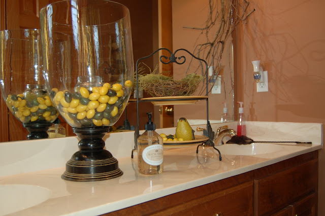
Spring is almost here and its time to bring in some fresh new colors and accents.  Take any glass piece and fill it with lemons and limes, then put a candle in the middle of the container.  One can use fresh lemons and limes or buy artificial ones from an craft store. 

Friday, February 18, 2011

Remodeling

Please excuse the mess while we renovate the blog!! New look coming soon!!

Tuesday, February 15, 2011

Outdoor Living

    As the weather starts to turn warm we are all more than ready to get back outdoors.  Now is the time to get outside and start cleaning up those decks and patios.  Don't jump the gun to soon and start putting all your decor out yet, but start thinking about how you want to decorate your area this spring.  Most popular colors at market this year are coral and turquoise, so add a few pillows or accent pieces to keep your area current and fresh.  If you don't have electrical outlet for lighting buy some wall sconces for candles and create a romantic environment for your family and friends.     Market Place in Columbia has a new booth" 808" come check it out and see all the new home decor for inside and outside.    I will soon post pics of outdoor living areas thatI hope encourage and inspire you to create a cozy living environment outdoors for yourself.
  • Outdoor fire pit for a relaxing evening.

Sunday, February 6, 2011

BE OUR GUEST

FRIENDS AND FAMILY: They're some of our favorite people in the world, so the last thing you want to do is put them in a guest room that feels less than welcoming.  Just take a look at these before and after pictures and think which room you'd rather visit after a long trip.

So, THINK SOFT:  light soothing colors, down bedding and new window treatments create a relaxing getaway.
THINK FRUGAL: the homeowner had just two pieces of art for above the bed, so I glued a moss wreath to the center of a framed, white thick poster board to create a grouping of three.  Dividing a tri-fold screen added architectural interest to two corners.  With this project, you'll create the sort of room your  guests will love, nearly as much as you love them.
 

THINK FUNCTIONAL: luggage can rest on small benches and guests can rest on a reupholstered chair.

Tuesday, February 1, 2011

Cottage in the Corner

When you've lived in a house for a while, your rooms can get in a rut.  Each one has its long established place, and none of them feels much like an escape.  But it doesn't take adding on to your house to find the space for a retreat.  Instead, look to capture a cottage feel.  Start with neutral paint and furniture that's perfect for an afternoon nap or conversation with friends. 

These rooms use a larger sectional, a functional ottoman, and a corner chair that's perfect for reading on a quiet afternoon.  You may not be able to get away from a television, but you can hide it in a decorative cabinet.  In this case, the screen pops up when you need it and lowers out of sight when you don't.  And your color in fun and unexpected places- bright pillows that can change with the season, dried flowers, even a cheery bird on a shelf. 

When there's no place for furniture, add architectural details to the walls.  This weathered window frame came from an old church.  Think color, comfort, and coziness, and you'll be surprised at how much room you discover thanks to even the smallest corner of cottage chic.

Thursday, January 27, 2011

All the Trimmings

Imagine your Thanksgiving dinner table for a moment.  The turkey's the centerpiece, but the trimmings make it sing.  Its the same with walls in your house. 


Take a look at these before and after pictures and you'll see how basic trim work can dramatically change the look and personality of your room.

Before, the wall is plain, with no real color or wow factor.  But after a carpenter adds some simple trim materials and paint ,the wall has a custom, full paneled look.

This is a great way to showcase special art, or anchor nearby furniture - in this case, the piano.  The trim comes in a variety of textures and patterns that provides a customized look to stand out from every other wall.  In terms of trimmings, think of this as a solution as the dressing.

Wednesday, January 19, 2011

How to Create a Lodge Cabin Decor

Combining Elements of remote wilderness animals and natural outdoor elements and turn them into decorative pieces.  Rustic style home decor pieces include such items as pine cones, antlers, birch wood, elk, deer, moose, fish , bear and racoons.  These items can be turned into functional designs that include lighting or furniture pieces.  Structural pieces, such as snowshoes, paddles, small birch boats and fishing items are a great finishing touch. Check out my picture gallery on merchant circle for more ideas on Lodge Cabin Decor.


Monday, January 17, 2011

Fill'er Up With A Special Cup

When your car needs refueling, you stop at a gas station: when your family needs refueling, give them a chance to stop at a hot chocolate station.  It takes just one square foot of counter space or table space to make room for an inexpensive and popular winter getaway. 


Fill simple decorative glass containers with flavored hot chocolate mixes .  You can buy these ready-made in a grocery store or go online to find simple recipes to make yourself.  Add a scoop, put out your favorite mugs, and as a finishing touch set out an extra mug filled with candy canes for stirring.  This is a quick, functional decorating that makes it easier for the kids to have self-serve treats, and makes your kitchen a destination point.  Enjoy this true conversation piece- as people chat over steaming cups of hot chocolate, and can't wait to come back for more.

Sunday, January 16, 2011

Wallpaper Trends 2011

Wallpaper is being seen more over the past couple of years, but mainly in powder rooms, small room, or accent walls.  Trends forecasts indicate thats all changing this year.  Expect to see entire rooms in beautiful designs and soft textured papers.  Paintable papers are also on the rise.  Check out  post from  ShelterPop to find more on wallpaper.
Been there done that with wallpaper ?? Coming soon other creative ideas, other than just an accent wall to set your space apart.

Saturday, January 15, 2011

Baby It's Cold Outside

When the weather gets too cold for flowers in your outside planters, bring the planters inside to let your decorating imagination bloom instead.  Fill one with dirt then pebbles and stone, top with some of your favorite natural pieces - grass, shells from a special vacation, maybe even a dried flower arrangement you've had sitting in the back of a closet somewhere.  


Top it with a piece of round pre-cut glass you can find at any discount store.  It won't put much of a dent in your budget, so you have a unique showcase piece at a price much less than something off the showroom floor.  Have fun seeing how this table can warm your house on a cold winter day.